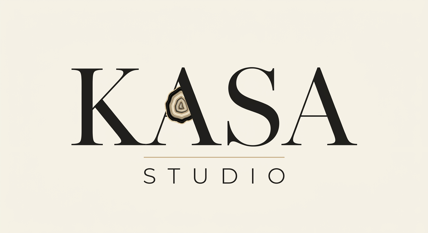
Hi Karen — here are three first directions for your logo, all drawn from your notes: elegant and text-based, with a subtle geode detail, in black, ivory and champagne gold. They share the same wordmark; only the geode changes. Rate each one, leave a comment, and answer a couple of quick questions at the end. There are no wrong answers. — Arnaud
Brown agate geode
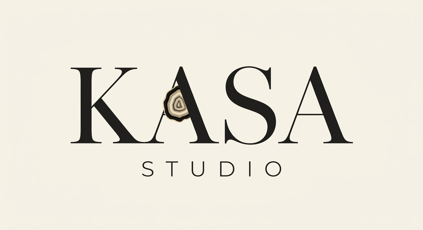
A realistic agate slice inside the “A” — the richest, most detailed take.
Champagne-gold bands

The geode simplified into smooth gold bands — clean, graphic, and right on your palette.
Subtle gold slice
A small champagne-gold slice tucked into the “A” — the most understated of the three.
A few quick questions
Which geode colour do you prefer?
How visible should the geode detail be?
Anything about the lettering, spacing or overall feel you’d change?
Your overall favourite
Your answers go straight to Arnaud. Takes one click.
Thank you, Karen!
Your feedback is on its way to Arnaud. He’ll refine from here.